Technologies
- Bootstrap 4
- CSS3
- HTML 5
- Responsive Web Design
- Sketch
- SVG
- PhotoShop Elements
- Parallax Scrolling
About
Tiny Cakes Bakery wanted a playful and fun custom one-page website where they could share their cakes with the world. A style-tile was provided setting the tone for colors, textures, button examples, and font choices.
I created a single page website with navigation links anchored to the correlating section of the website. It stays stationary as you navigate through the site so you can easily go wherever you want.
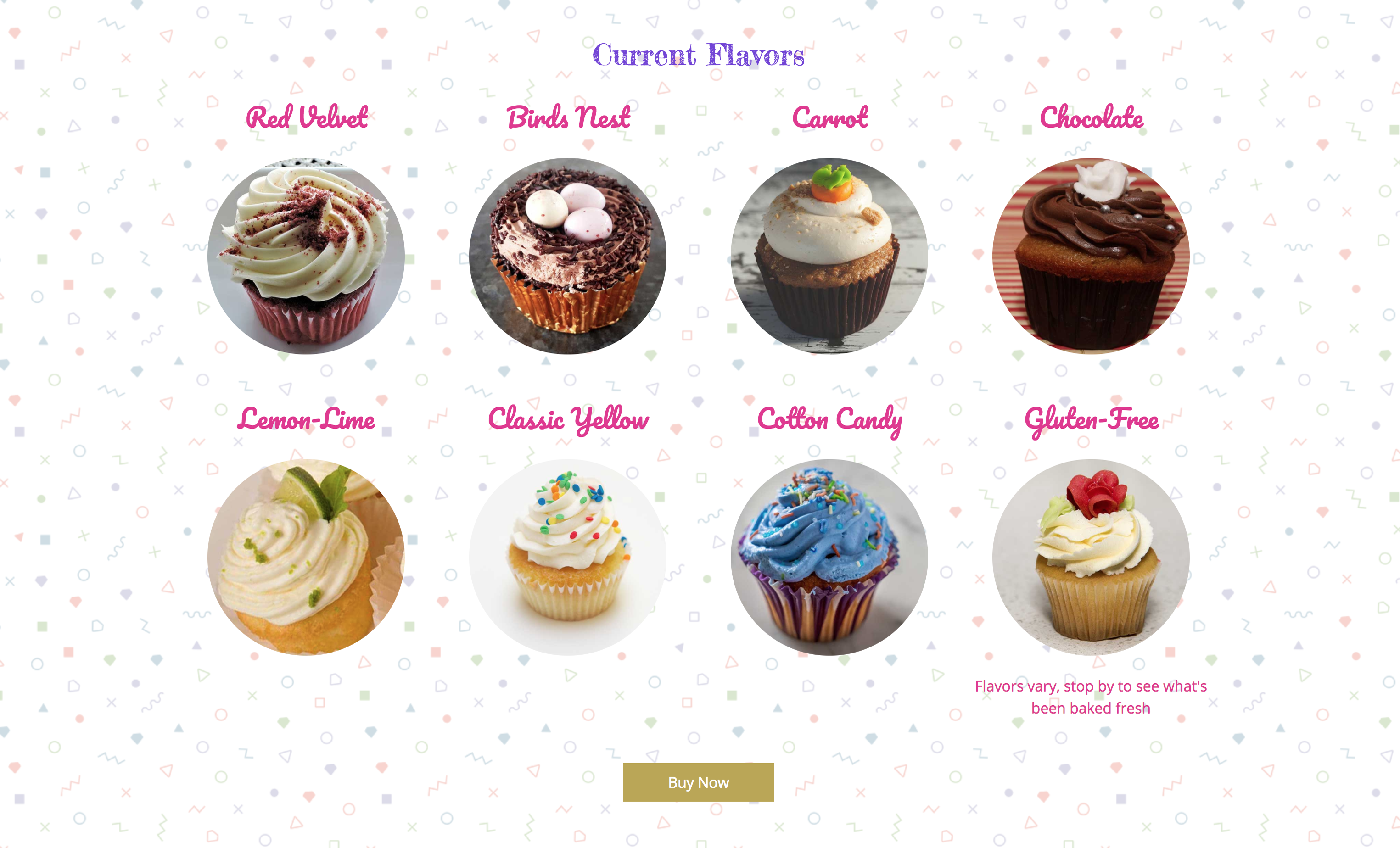
The mission of Tiny Cakes Bakery is to share their tasty creations with the world, so I wanted to ensure those cakes were front and center so I’ve placed their products first.
This page has several technical features.
The homepage features a large image which I’ve added parallax scrolling.
The store utilizes Bootstrap 4 adjusting the number of items per row according to the size of the viewport.
The about and history sections are brief so I placed them next to each other and gave them a colorful background that stretches to the edge of the page. The result was not as visually interesting as I had hoped. For larger viewports, I decided to offset each segment in opposite directions. Because each segment takes 100% of the viewport on smaller screens the effect doesn’t translate into mobile viewing. Instead of leaving each section stacked on top of each other in a singular color, I decided to pull the headers in different directions, wrap them in contrasting colors, and offset them boxes to give a complementary vibe that utilizes the available screen sizes.
For the footer icons, I used SVG images instead of loading an icon font.
